Preston Murphy layers texture and color to create a bold, but cozy Aragon Court home
BY KELLY ODEN / PHOTOS BY GREG REIGLER
WHEN LOCAL REALTOR® PRESTON MURPHY BOUGHT HIS ARAGON COURT HOME, he envisioned something bold and eclectic for the interior design. Initially inspired by the citron fabric that now covers his dining chairs, Murphy worked with local interior designer Cheryl Kees Clendenon of In Detail Interiors to pull the rest of the look together. The design incorporates many of Murphy’s interests and tastes to create a luxurious and cozy lounge vibe.“The space needed to envelop its occupants in a warm wash of texture and the right balance of colors,” Kees Clendenon said. “Each selection was an assessment of weight, texture and curve — bold but not bright, and luxe without feeling too posh or bling-y. We love that the outcome was something more traveled. When a space can feel well balanced and particular in its appointments, you know you are on to something. ”Kees Clendenon calls Murphy the ideal client, saying, “He trusts the process and this is how a client gets the best out of this type of project. He allowed us to do our intake on his needs and wants, then stepped back and let our team deliver the magic.”
LIVING AREA

MURPHY’S LOVE OF TEXTURE AND TEXTILES IS EVIDENT THROUGHOUT THE HOME. The deep gray grasscloth covered walls set the tone of the living and dining spaces. An eclectic mix of rich textiles in both furnishings and accent decor combine to weave a bit of Asian culture into the modern design. “I’ve learned to just kind of trust the process,” Murphy said. “If I’m drawn to it, and it makes sense, I’ll incorporate it. I’m not trying to do matching—I’m not trying to coordinate, so to speak. It’s really just the layering on of all of the different textures, patterns and colors. ”Murphy chose the bold floor lamp specifically for its Asian aesthetic. “The gold, brassy tones and the tiered shape reminded me of the temples in Asia,” Murphy explained. “When you layer it with the dragon pillows and the geishas, it just went perfectly.”Long drawn to faces in art, Murphy chose a number of portraits and people-focused paintings to adorn the living room walls. He also commissioned the large painting of Johnny Depp from New Orleans artist, Nancy Rhodes Harper. “Lighting and art were both about telling a story in this room – accenting conversational opportunities and an almost gallery-esque feel,” Cheryl Kees Clendenon said. “The lighting has a more dynamic and unusual, sculptural feel – from the harder lines of the statement floor lamp in the living room across to the sprawling, slightly modern bloom of the dining area fixture.”
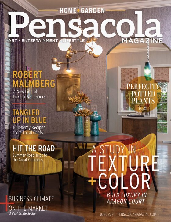
DINING
IN THE DINING AREA, A ROUND CERUSE WOOD TABLE CREATES A COZY AND INTIMATE SPACE, WHILE THE LOW PROFILE CHAIRS IN THE INSPIRATIONAL CITRON VELVET FABRIC ADD A POP OF RICH COLOR. “I always use round dining tables because I think they promote conversation,” Murphy said. “The shape also works well because this isn’t so much a dining room as it is a dining space, and I thought it needed some roundness.” The whimsical chandelier over the dining table brings to mind bubbles or water droplets and adds an element of fun to the space. Relief artwork in a brassy gold adorn the dining area walls, along with the black and brass sconces carried through from the living area. “I see people sort of turn their nose up to gold sometimes,” Murphy explained. “I just thought, especially with this lounge atmosphere, that it was the perfect element to introduce to the space.An Asian-inspired, curved sideboard creates a functional storage space and the stunning black and gold lamp carries through the black and gold motif. “I just love this lamp,” Murphy said. “I thought it was edgy, but still soft in a way. It also just kind of reminded me of an insect.” A small powder room sits just down a small hallway from the dining area. The grasscloth motif is carried through here, as are the black and gold light fixtures. “We are always keen to get our hands on a powder room because it is the most frequented room by guests and is a ripe opportunity for something really special,” Kees Clendenon said. “Powder bathrooms are small. They’re solo players in their own little game. You can go wild because it’s almost like a great piece of art. This home was no different and a bold grass cloth with color and a bit of shimmer felt like the perfect fit. Sculptural sconces that we tracked down at market contributed a lot of style and that slight nod to the Far East, while the vintage geisha prints tied everything together in terms of theme. There really is only so much you can do in a powder bath, but to the same degree there is so much you can do with the right selections that can make it feel fun and punchy without being gaudy or way overdone.”


“In small kitchens and open concept gathering spaces, you always have to consider how one selection impacts the next. You don’t want the colors and style to feel matching or contrived, but instead unified and in good syncopation.”
KITCHEN


THE KITCHEN CONTINUES THE GRASSCLOTH WALL MOTIF, BUT IN A LIGHTER SHADE AND WITH A TEXTURE REMINISCENT OFSNAKESKIN. Elongated subway tiles and up-lit floating shelves create a clean, modern look. A kitchen island holds the solid surface, apron sink, which makes prep work and cleaning while socializing a breeze. A modular wooden lamp hangs from the ceiling above the kitchen table. A built-in bar offers plenty of space for glassware and spirits, while bold artwork ties together pops of color to completes the look. “We would have loved to gut and start over in the kitchen, but more of a refresh did just what the space needed,” Kees Clendenon explained. “These finishing touches—adding the basic hood, opening up the visual with floating shelves for display, and unifying the new and old with a simple but pretty backsplash—gave the space more character than it had with the basic dark wood cabinets. In small kitchens and open concept gathering spaces, you always have to consider how one selection impacts the next. You don’t want the colors and style to feel matching or contrived, but instead unified and in good syncopation.”

MASTER BEDROOM

THE ORIGINAL MASTER BEDROOM WAS A RELATIVELY CLEAN SLATE ACCORDING TO KEES CLENDENON. “Wrapping the room in a deep cocoa basket weave grasscloth felt texturally luxe while functionally warm and enveloping,” she said. “This was the groundwork for the fabrics and mood that the case goods needed to demonstrate—cultured and high style, but clean. Murphy and the In Detail team spent a lot of time considering balance in the master bedroom. On the headboard wall, there was one window to the left side of the bed but nothing to the right. “Creating visual weight and interest with the sculptural pendant light makes the wonky window placement opposing it feel purposeful. Like yin and yang—each component to this visual needed to contribute a complementary energy.” Kees Clendenon explained how the use of color and texture carried through and played a big role in overall design of the“Creating visual weight and interest with the sculptural pendant light makes the wonky window placement opposing it feel purposeful. Like yin and yang—each component to this visual needed to contribute a complementary energy.”

“The window treatments were bold and very graphic in pattern, so the nightstands couldn’t just be plain,” she said. “We designed a frame for the space that could be “color blocked” in finish and offer some visual weight. And while it took an act of congress to have the bed made, it’s canopy style is open enough to complement the room’s size, while visually substantial enough with the brass accents and upholstered headboard panel to be a showstopper.”

